by freddy__gtz | May 26, 2022
Branding
Pérez Correa
l a w y e r s
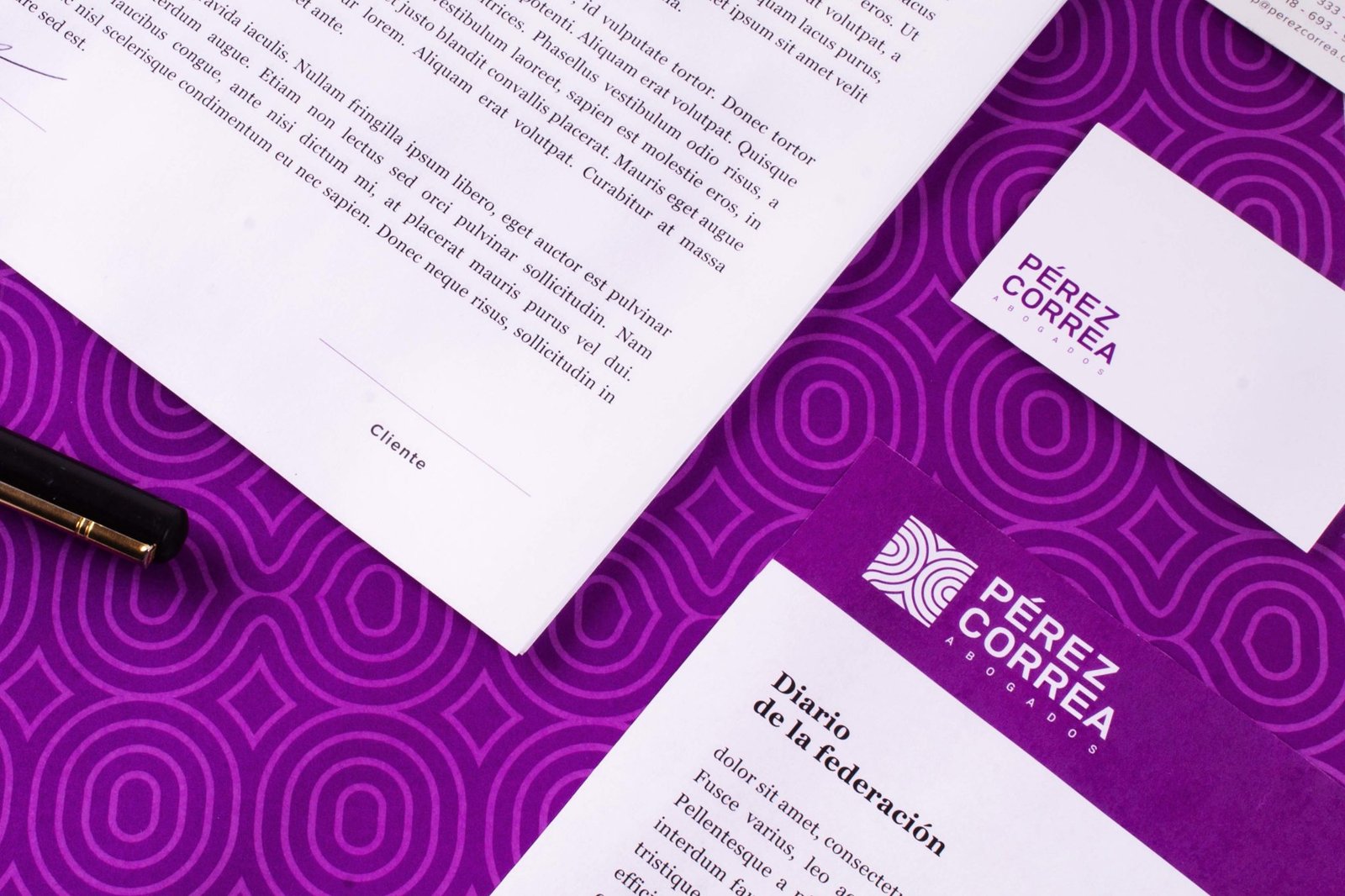
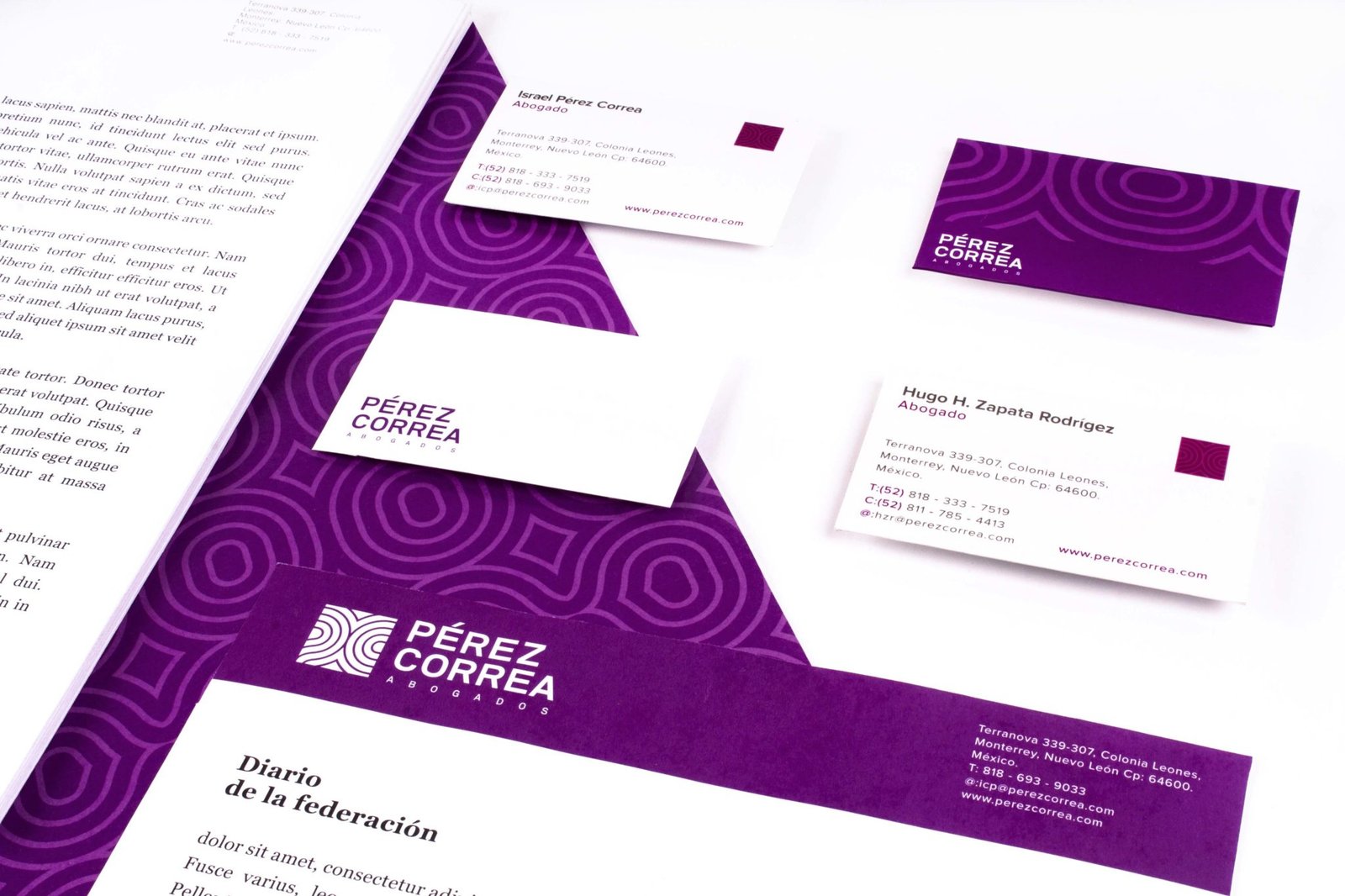
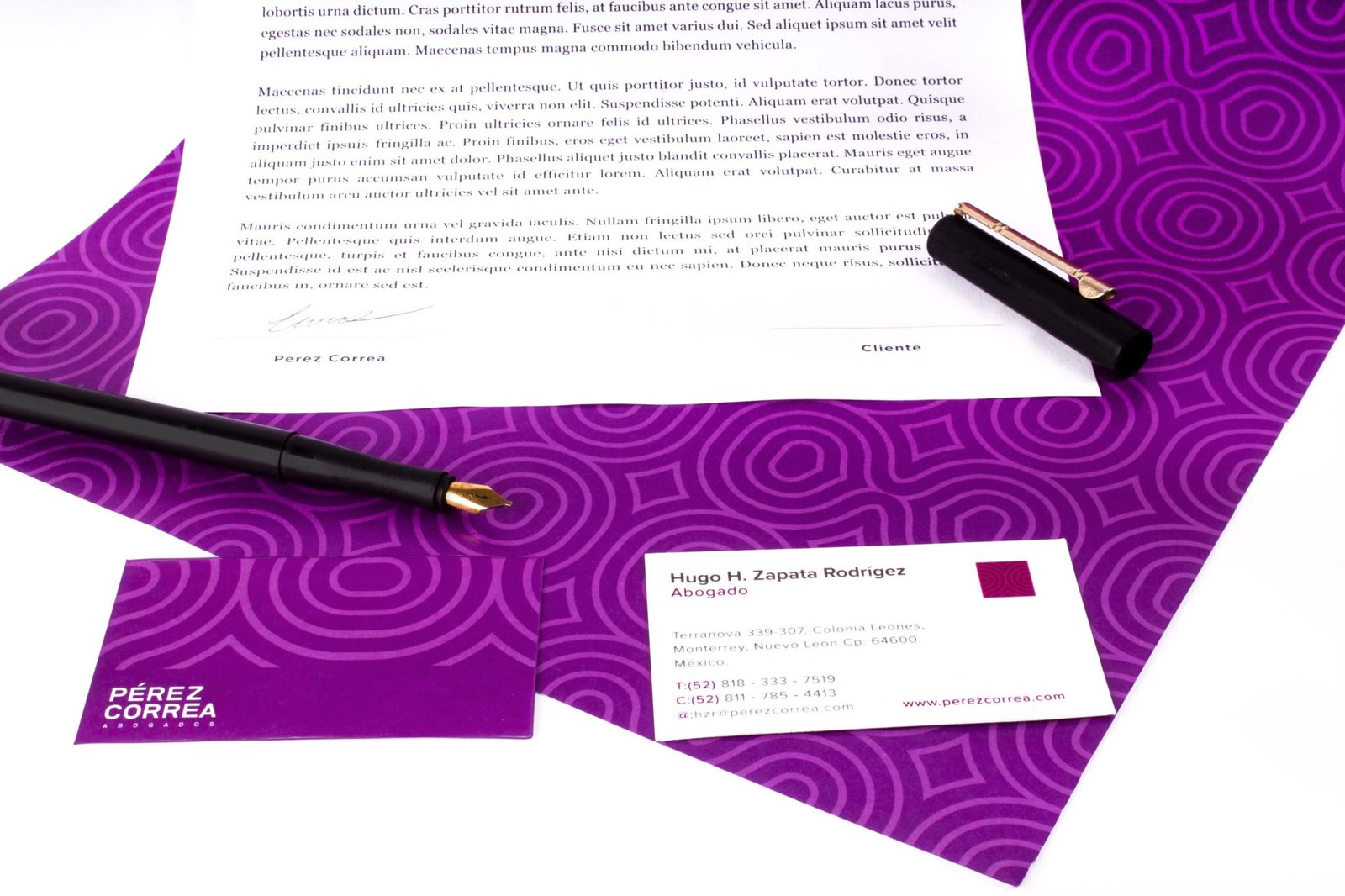
A law firm specializing in the protection and defense of intellectual property.
The logo and identity emerged from the creation of an icon that repeatedly uses the letters "P" and "C" to create a pattern resembling a fingerprint.
This is as unique as each of their clients' creations.
by freddy__gtz | May 26, 2022
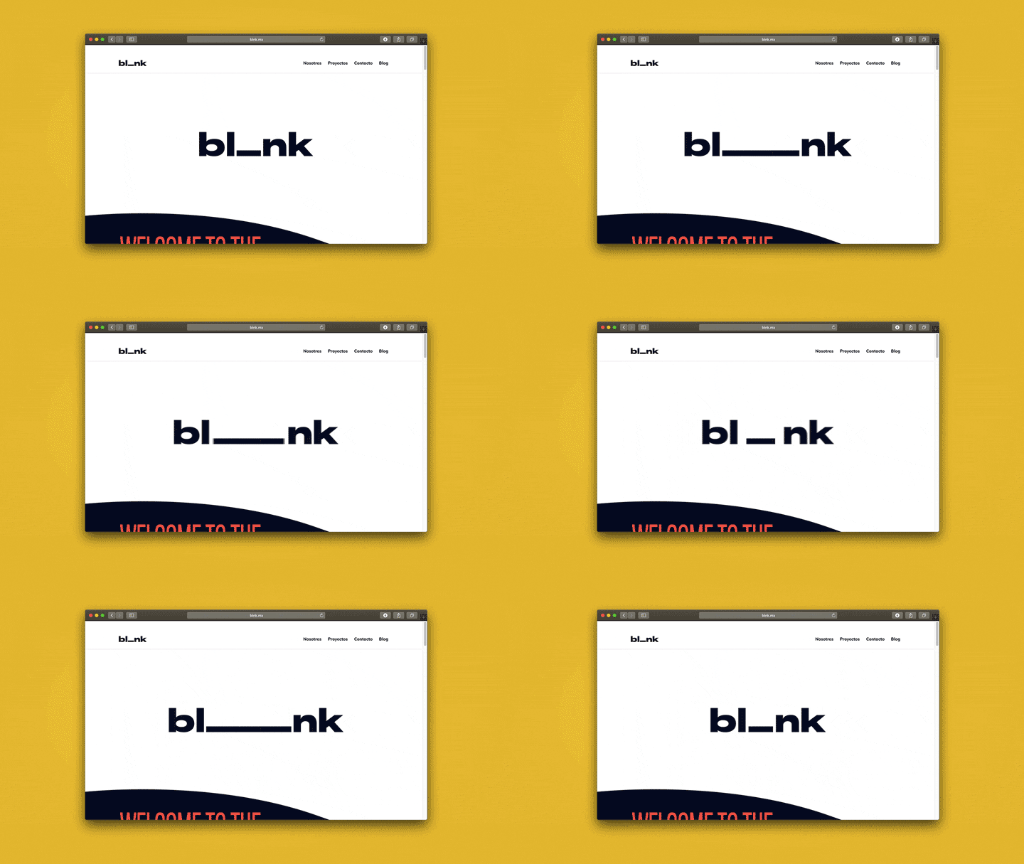
With the arrival of new team members and the growth in our service offerings, we couldn't maintain the same image and communication style. Therefore, today we present our new branding, which, more than just a new look, represents a more efficient and comprehensive service for all our partners.
Director: Alfredo Gutiérrez
Design: Rebeca Treviño
At Blank, we are a studio in constant growth and improvement. For our clients, in this process of improvement, the letter A becomes a symbol that represents them, because they are the ones who allow us to be who we are. Therefore, we give it to them as a symbol that they complete us.