by freddy__gtz | May 26, 2026
Dance studio
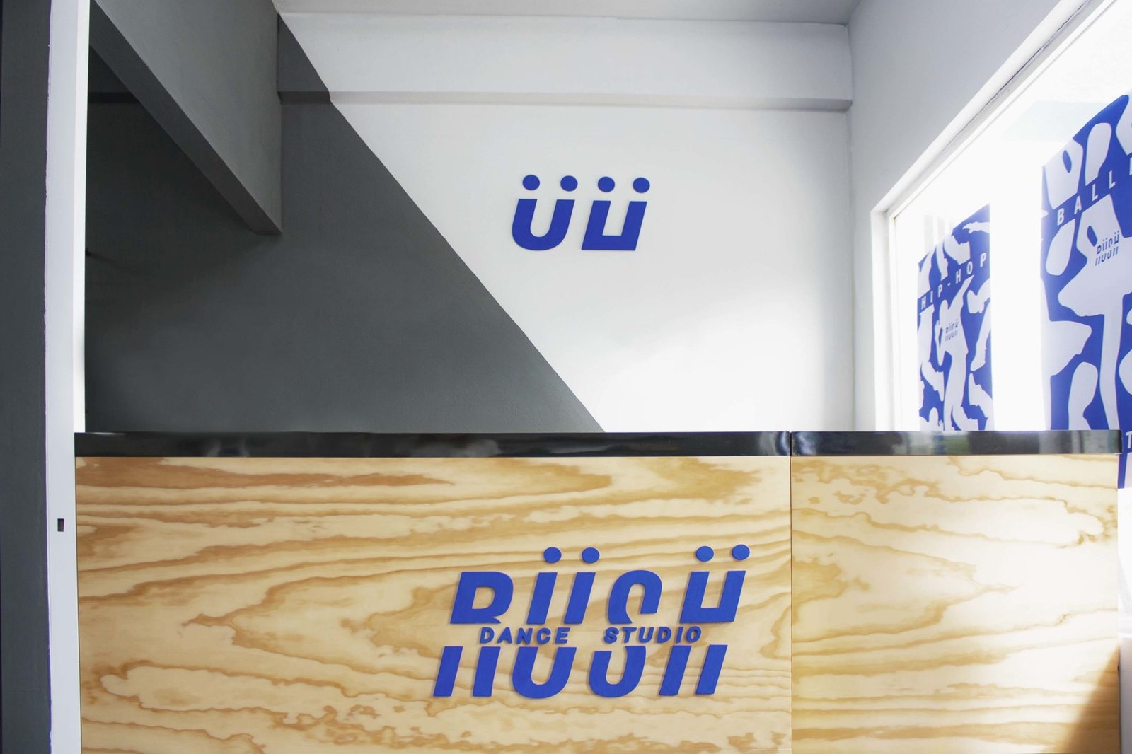
Branding and interior design for a hip-hop dance academy.
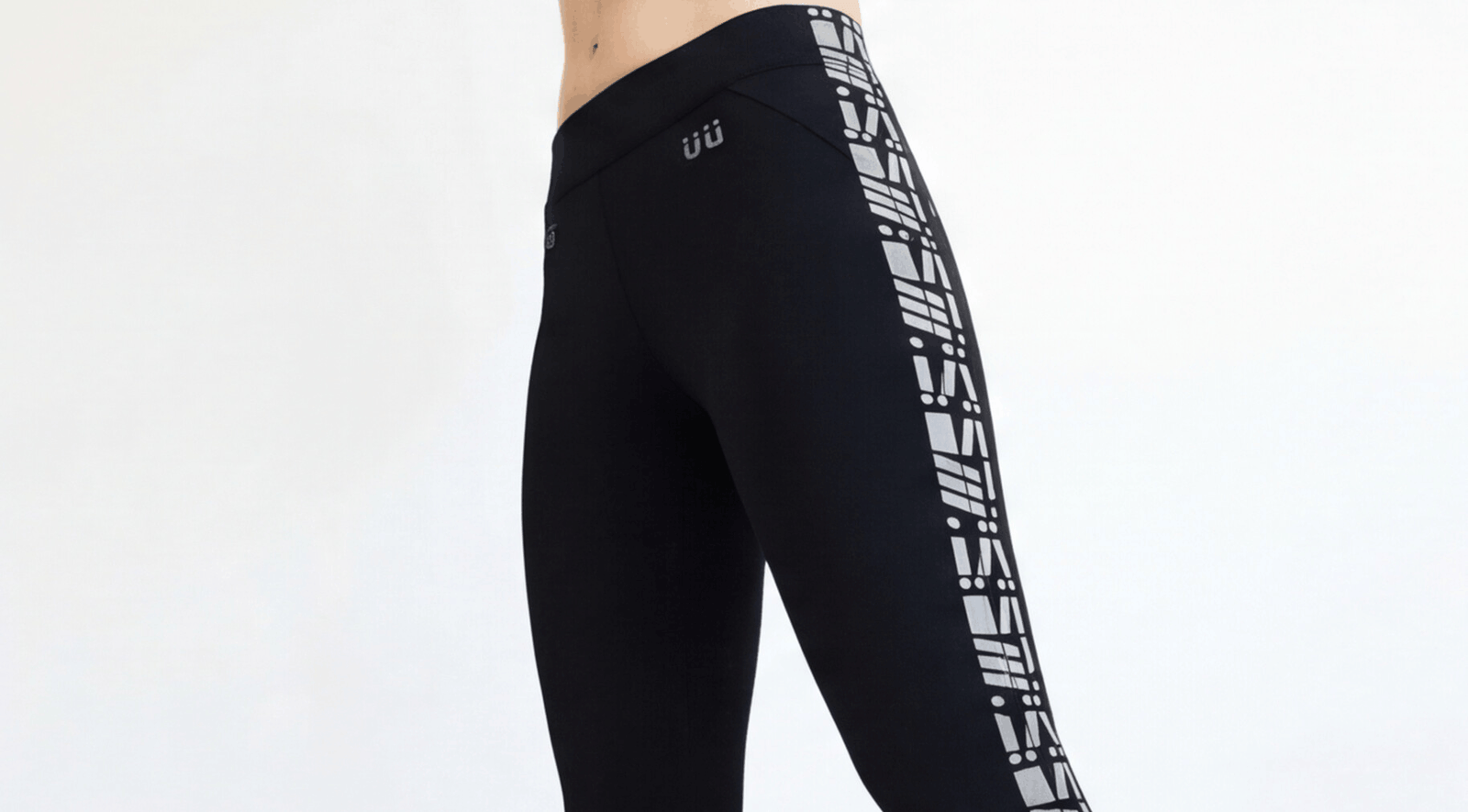
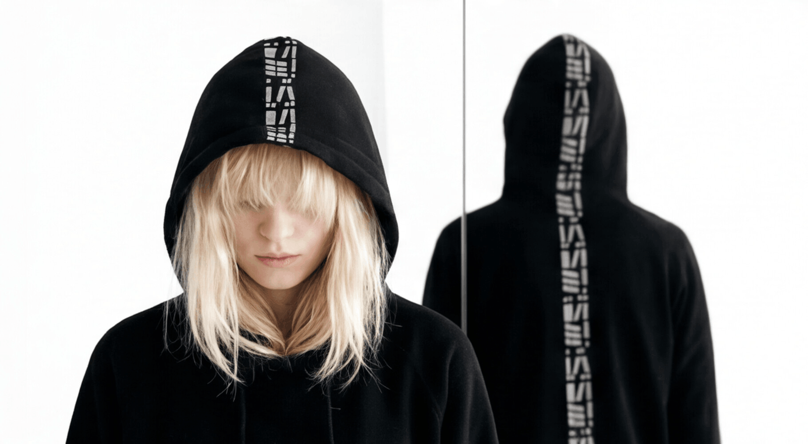
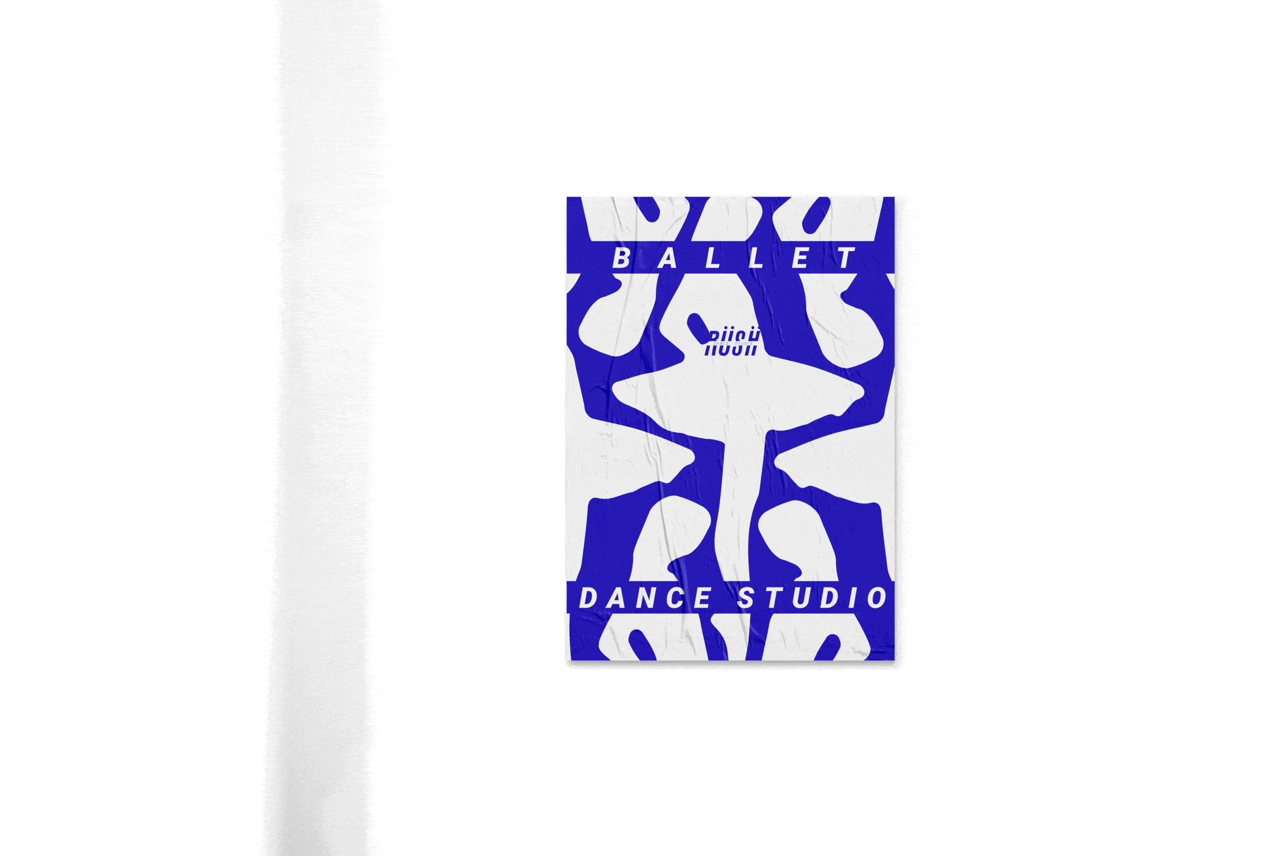
Adrenaline, that incomparable spark of energy felt before going out to dance, is the guiding concept behind a brand identity design that emphasizes movement and learning, with a student-centered business model, so that they become our best advertisement.
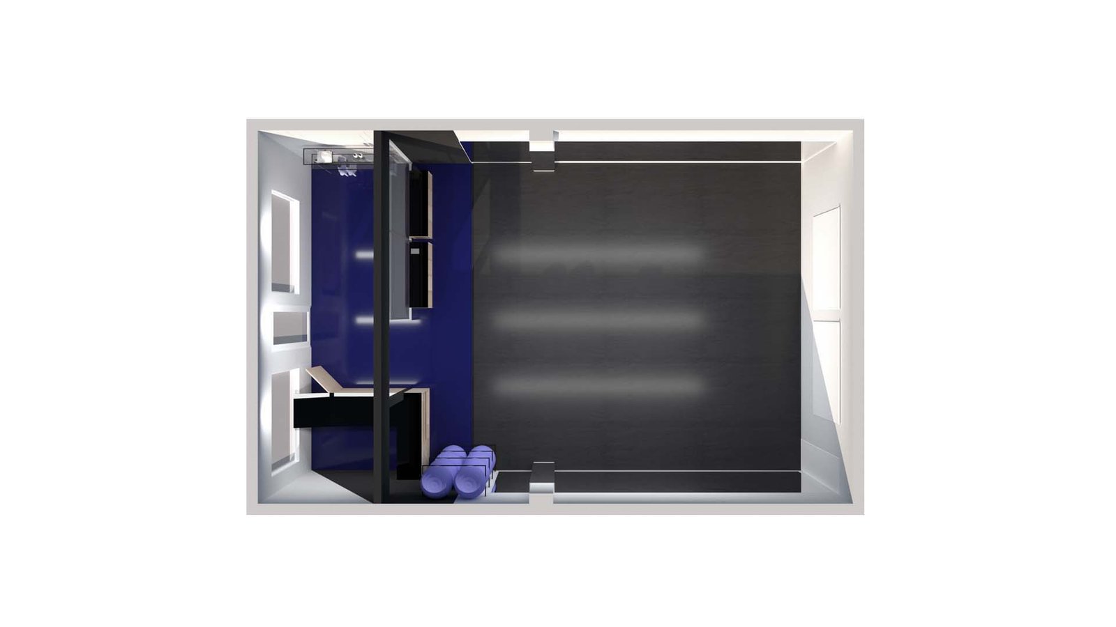
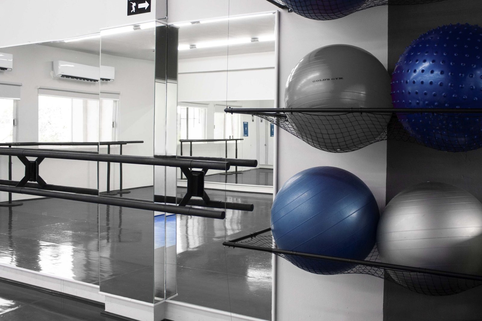
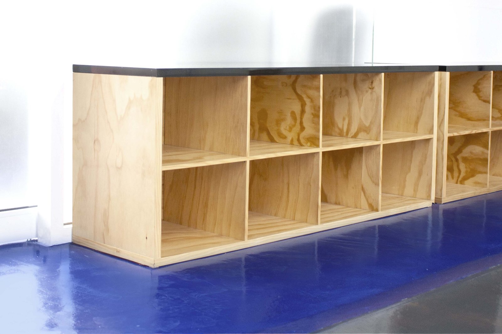
The branding and interior design is oriented towards hip-hop and teaching, so the reference points that dancers use to learn to align their hips and shoulders are simulated, and an interior is created that emphasizes the student, to clearly see the movements, thus helping the teaching of the steps.
by freddy__gtz | Nov 25, 2024
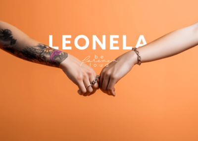
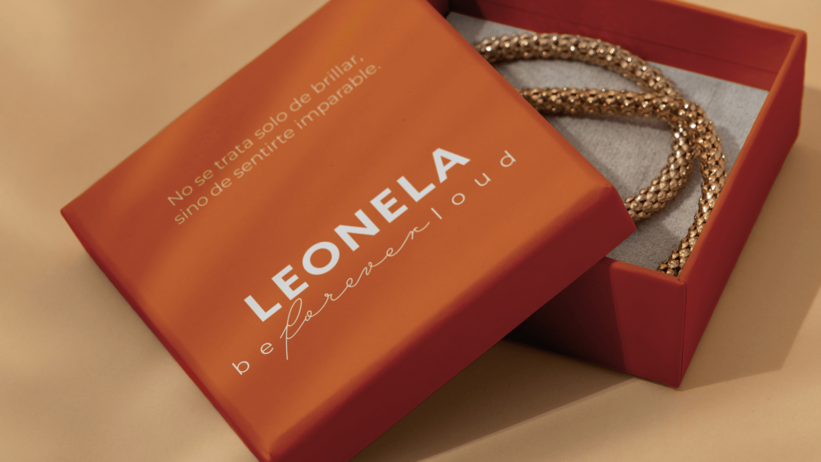
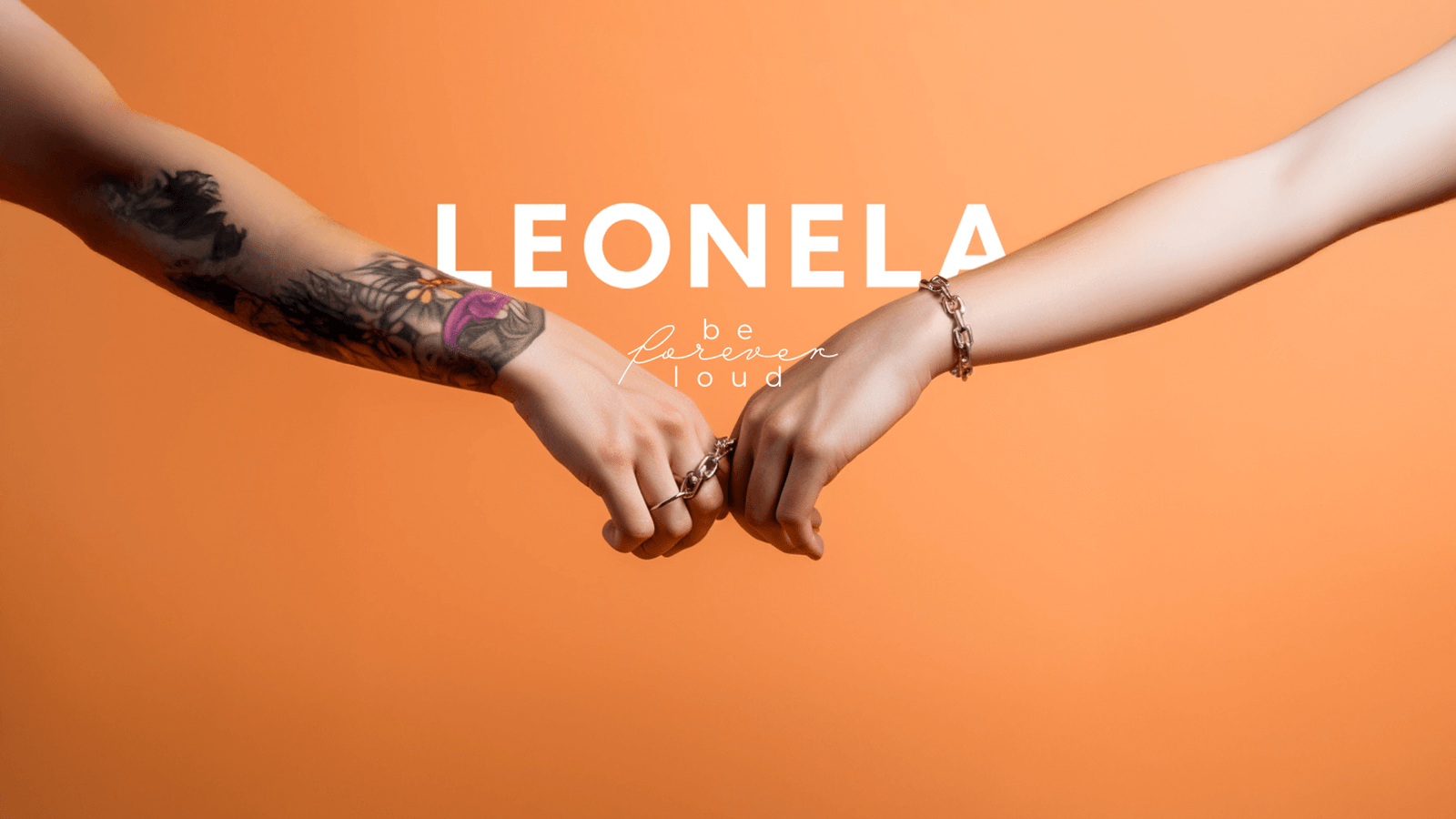
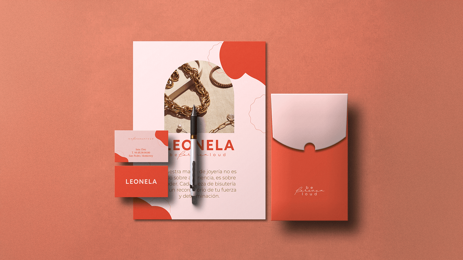
At Leonela, a jewelry company, we understood from the very beginning that we don't just design exquisitely beautiful pieces, but create symbols imbued with meaning. Each necklace, ring, or bracelet is not simply an accessory: it's a statement of strength, courage, and inspiration for the wearer.
Our branding approach focused on capturing the essence of Leonela and conveying it authentically. We designed a visual and verbal identity that celebrates femininity in all its forms, highlighting that every woman has a unique story that deserves to be told. Thus, Leonela jewelry not only adorns but also becomes a tool for personal expression and freedom.
The result is a brand that inspires confidence, connects emotionally, and empowers its audience with a clear message: authenticity is the true jewel. ✨
by freddy__gtz | Aug 9, 2024
Sabor Cortés
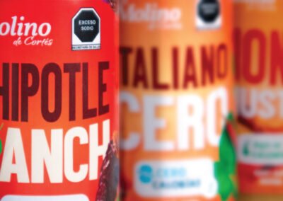
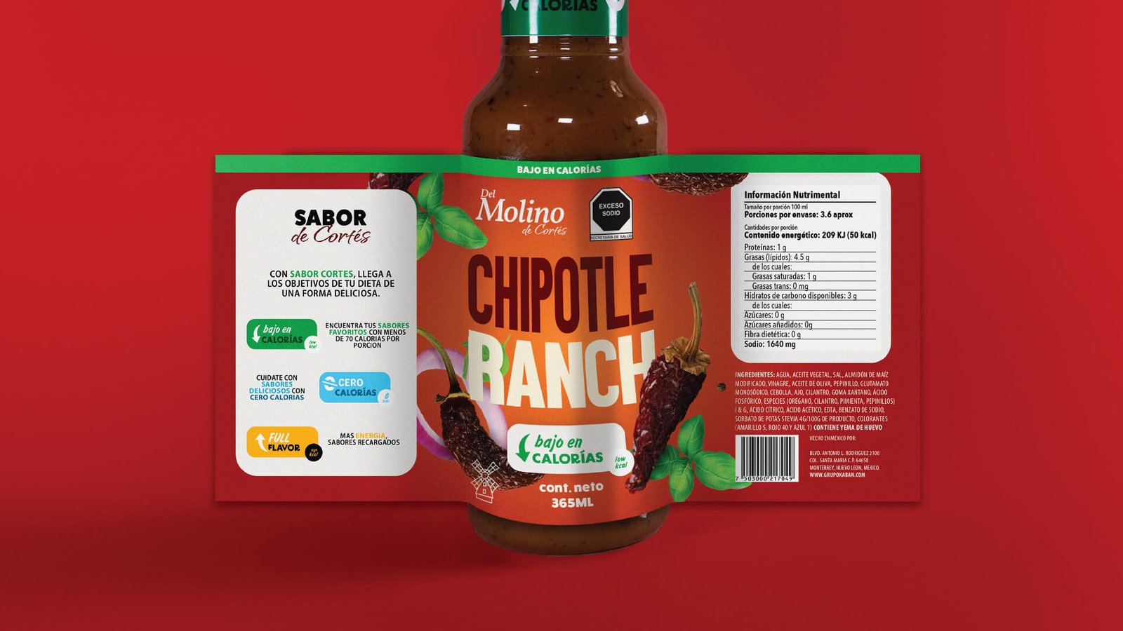
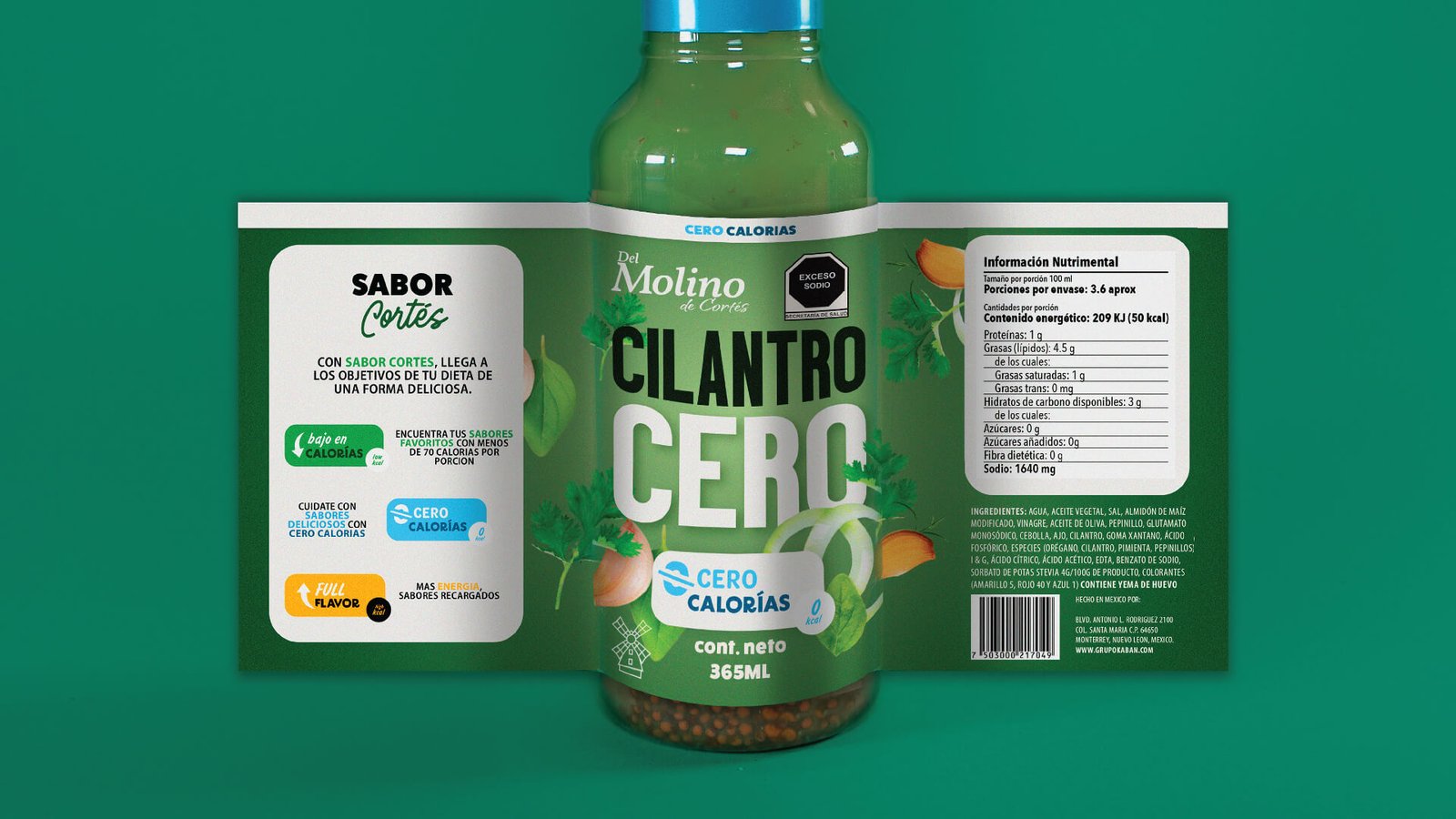
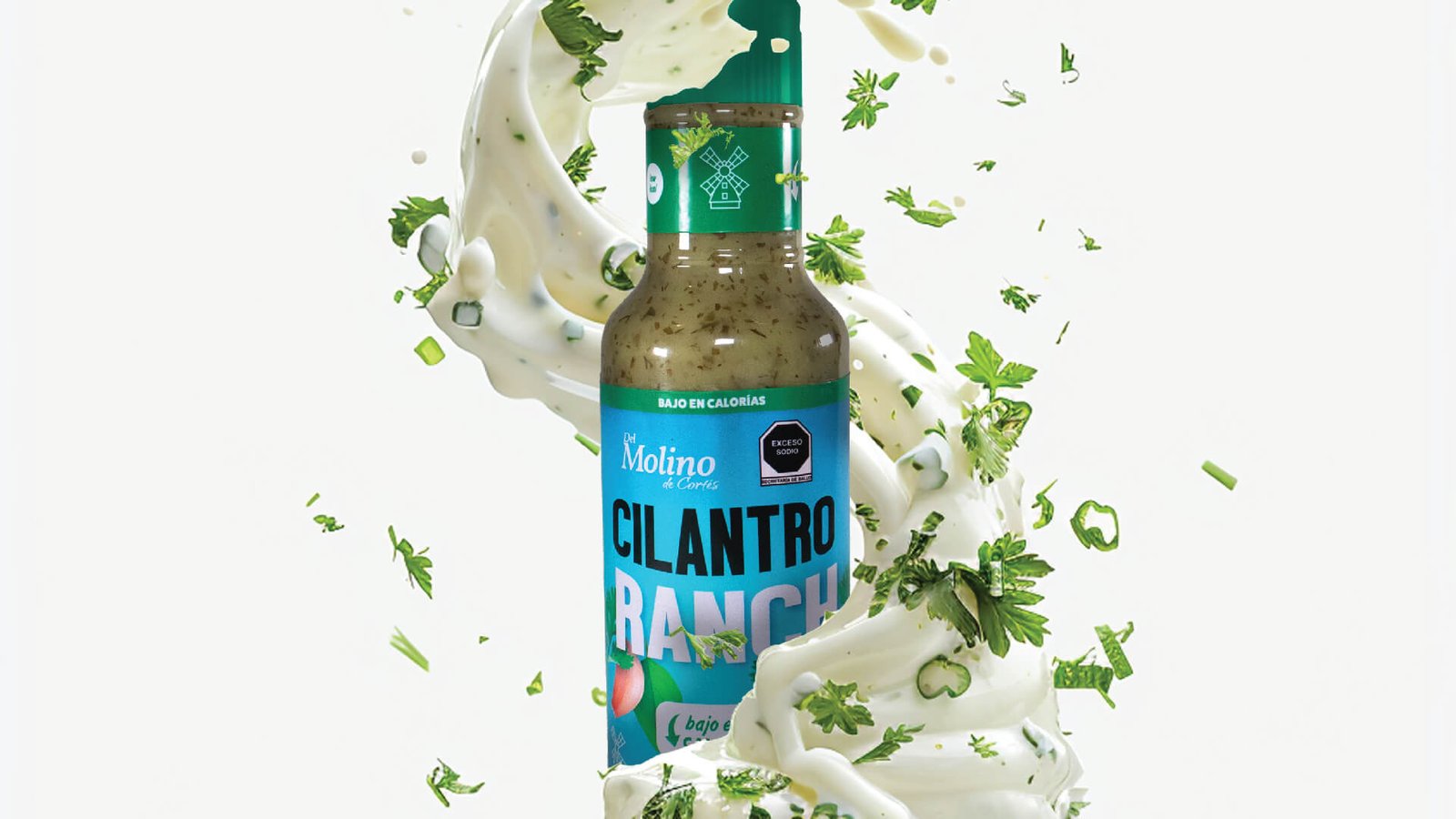
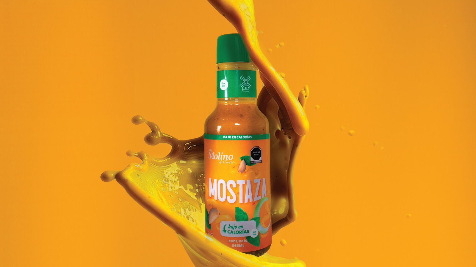
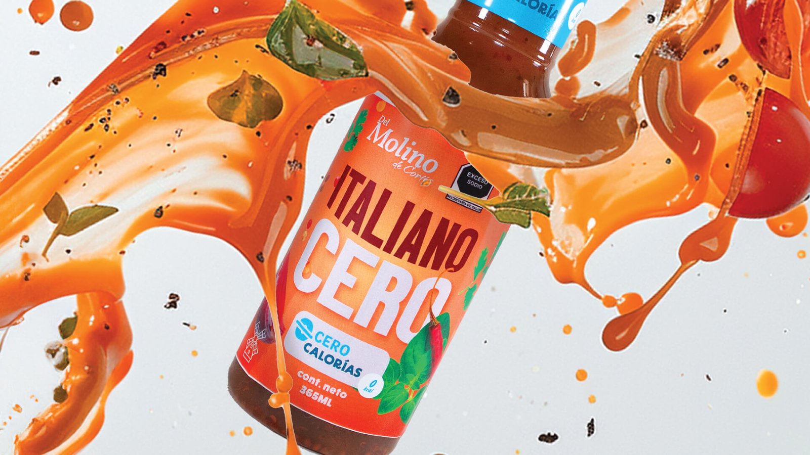
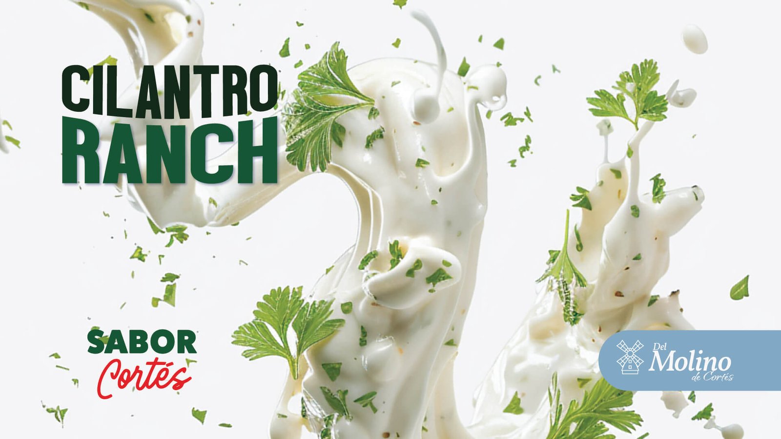
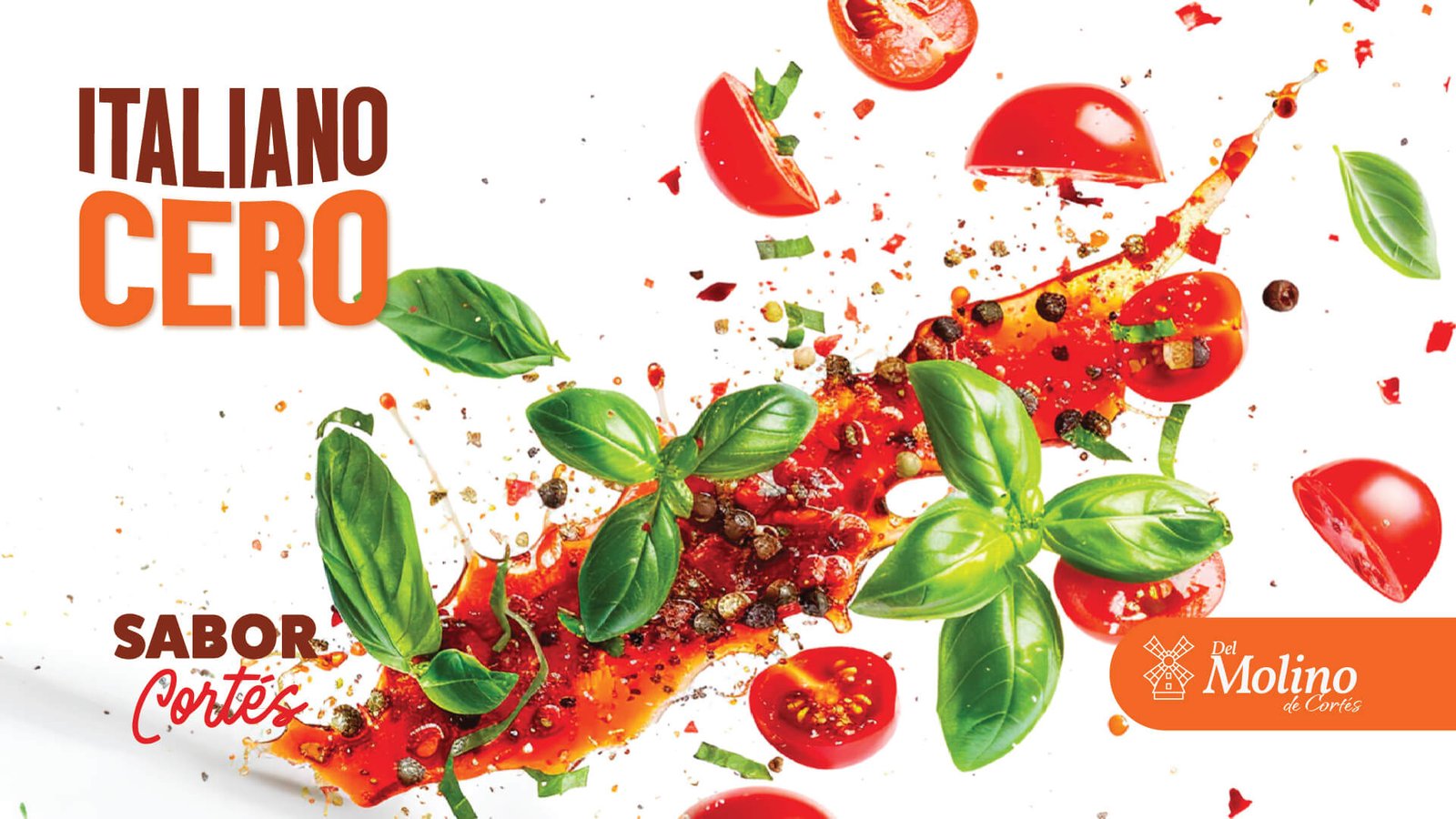
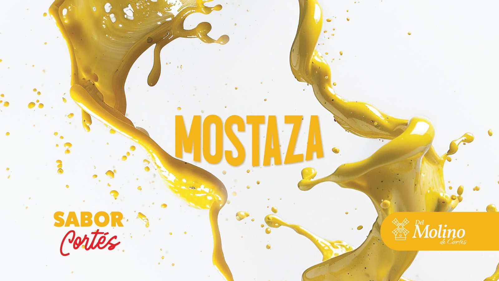
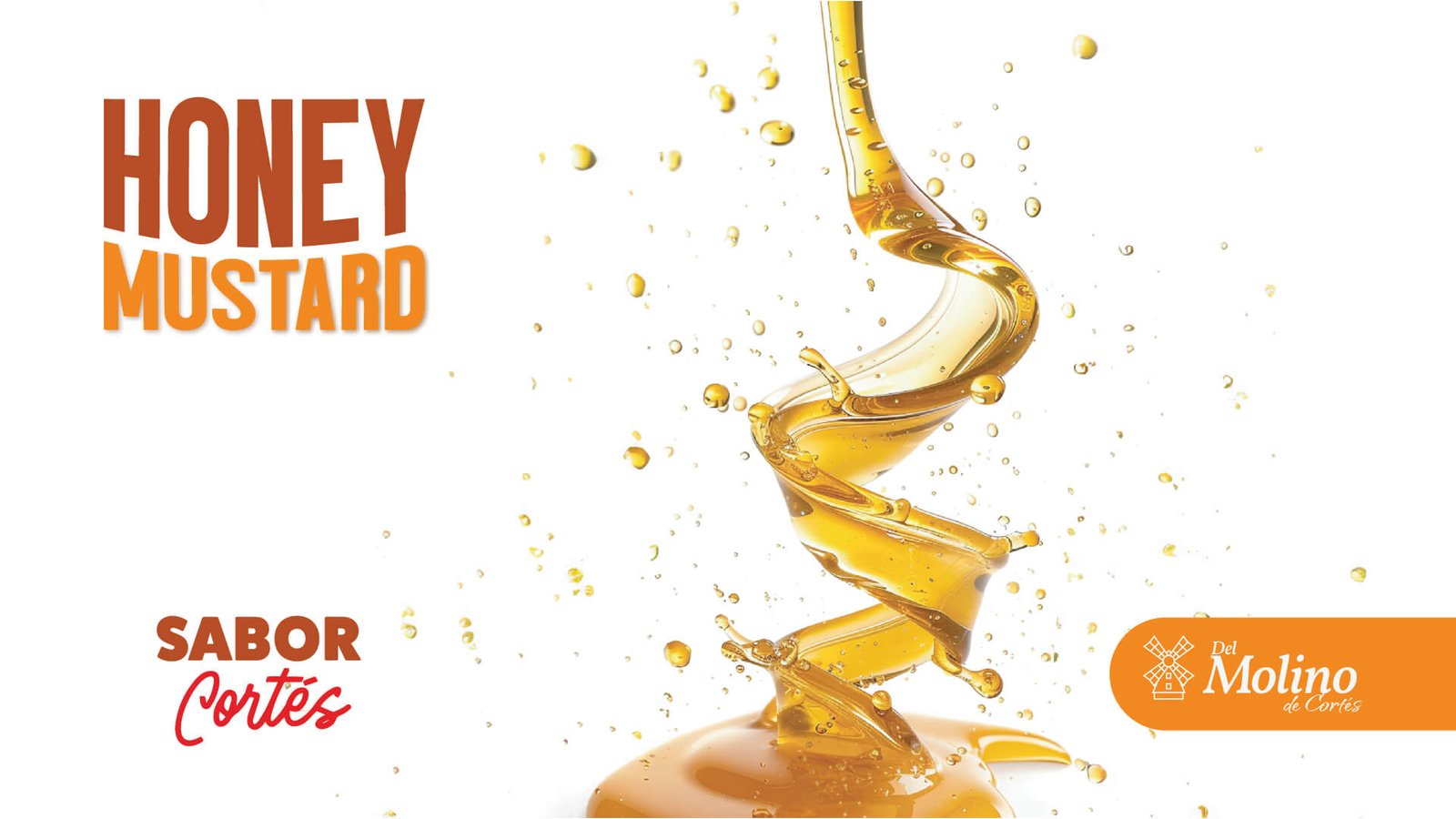
A Monterrey-based brand, Del Molino de Cortés brings exquisite dressings to your table. Using the Cortés family name and the analogy of "a healthy product is courteous to the body," we created the Cortés Flavor concept to communicate that in every drop of their dressings, we find the love for fresh vegetables and the superior quality that only the Cortés family's experience can offer.
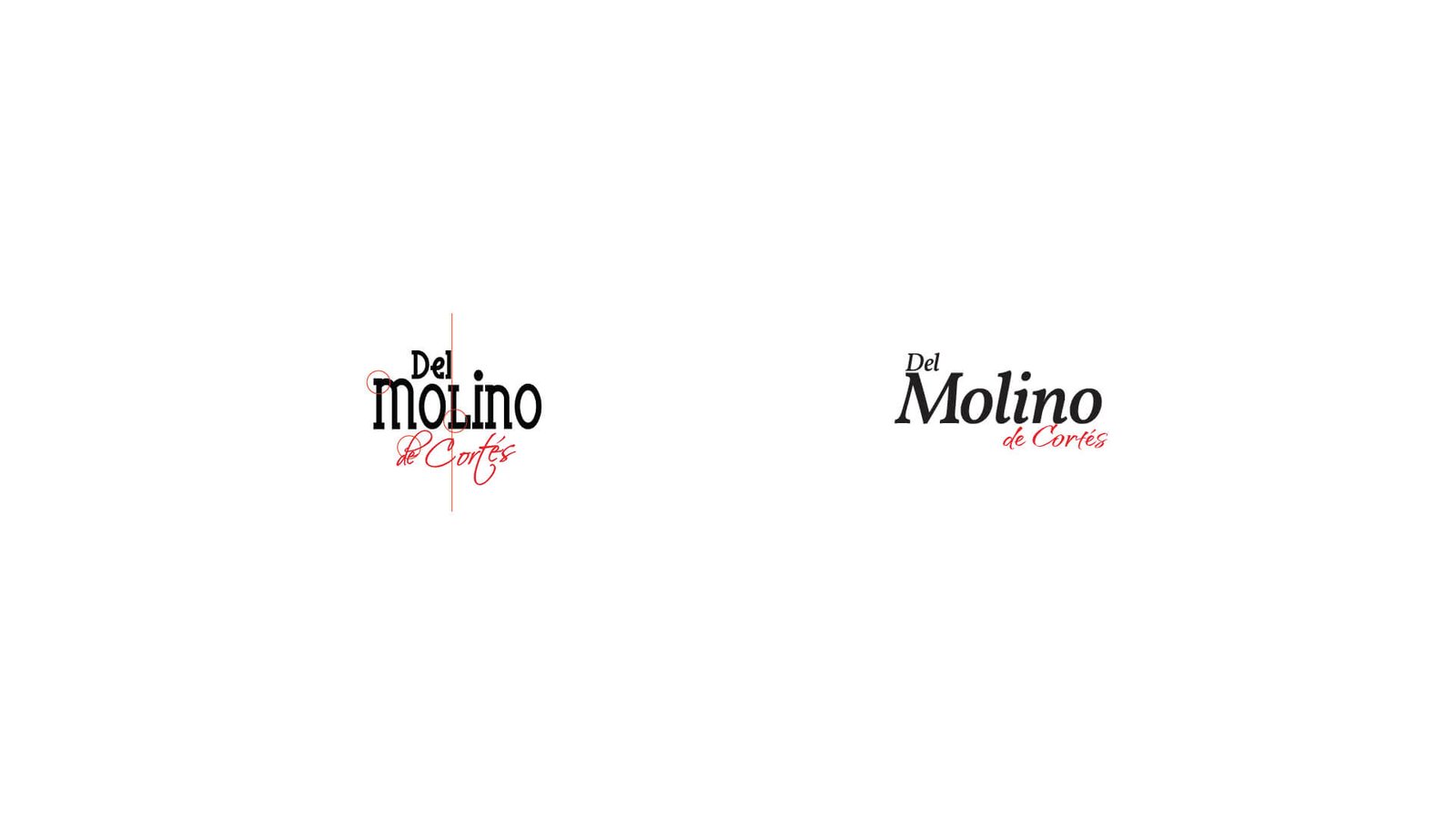
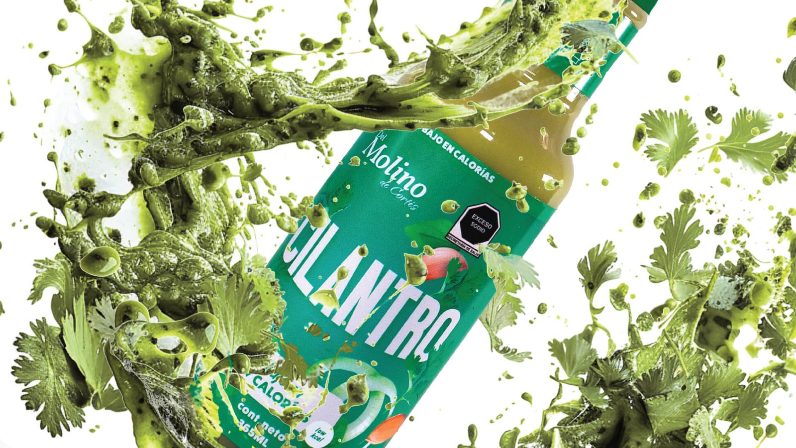
We carefully redesigned the brand, preserving its core structure and defining aesthetic while adding a touch of freshness. Our focus has been on refining the details, from the harmonious use of uppercase and lowercase letters to the clarity of our typography—all designed to capture the eye. We also added dynamism to our packaging with vibrant ingredients and bold colors that highlight our dressings, ensuring that each product is not only a visual delight but a true star on any shelf. This ensures that our visual identity is not only more pleasing to the eye but also utterly memorable.
by freddy__gtz | May 26, 2023
Naming · Branding · Advertising Campaigns · Digital Marketing
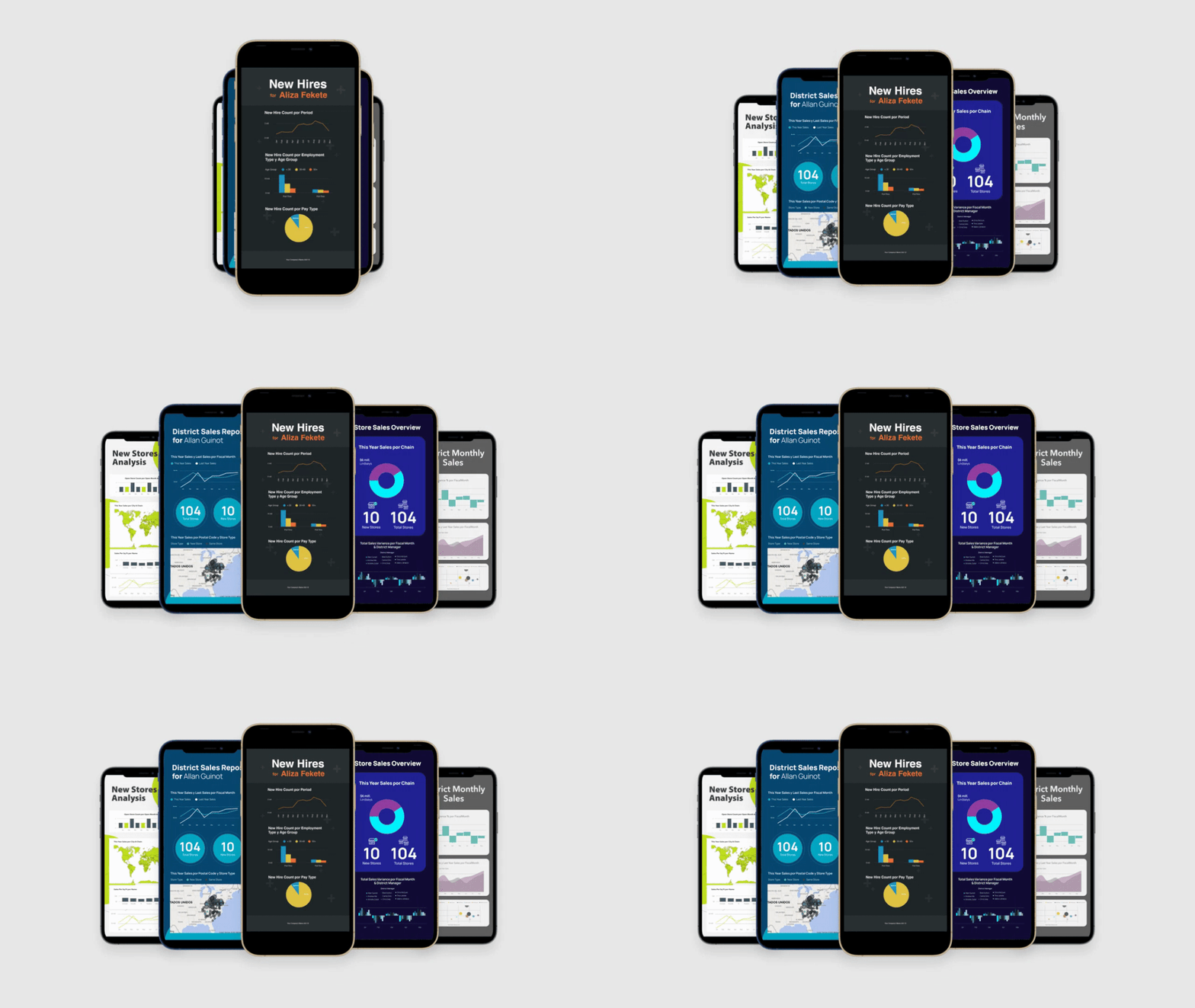
An uninformed decision can cost a company thousands of dollars. Dashboards MX focuses on data visualization to help people make smart business decisions based on information.
Advertising Campaign
The brand's guiding concept was the arc, a tool that helps you reach your goal more efficiently, quickly, and with better results. Dashboards were also used. The objective was to make the brand's digital marketing sustainable through Google Ads campaigns, which direct the end user to specific landing pages that facilitate their search, and by building a community through executive education with specialized content.
by freddy__gtz | May 26, 2022
BMED Manufacturing is a company dedicated to the production of prosthetics and medical parts using 3D printers.
We developed a clean graphic communication and identity that maintains a serious and organized image. The logo we created for the brand symbolizes the cycle of life.
The circle is composed of two parts, where the smaller part serves as a complement to represent a prosthesis or one of the other products that BMED manufactures.
We carefully redesigned the brand, preserving its core structure and defining aesthetic while adding a touch of freshness. Our focus has been on refining the details, from the harmonious use of uppercase and lowercase letters to the clarity of our typography—all designed to capture the eye. We also added dynamism to our packaging with vibrant ingredients and bold colors that highlight our dressings, ensuring that each product is not only a visual delight but a true star on any shelf. This ensures that our visual identity is not only more pleasing to the eye but also utterly memorable.