by freddy__gtz | Nov 25, 2024
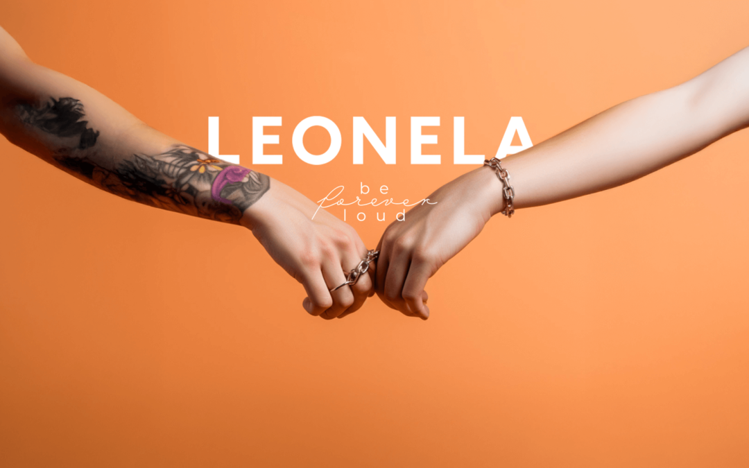
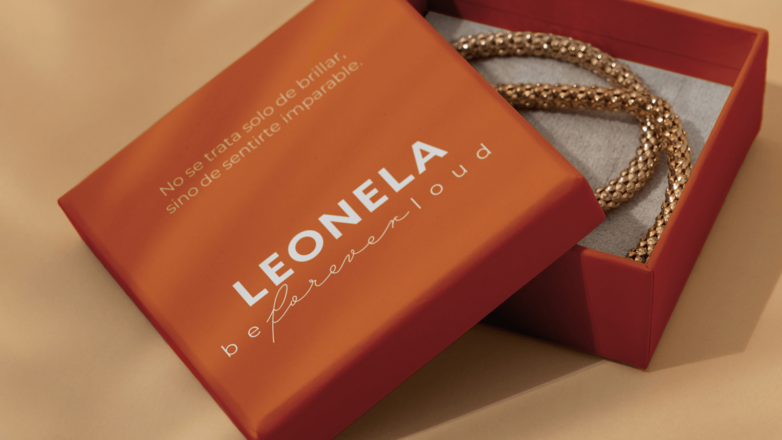
At Leonela Jewelry, we understood from the start that they design not only pieces of exquisite beauty but also symbols loaded with meaning. Each necklace, ring, or bracelet is not just an accessory; it’s a statement of strength, bravery, and inspiration for the wearer.
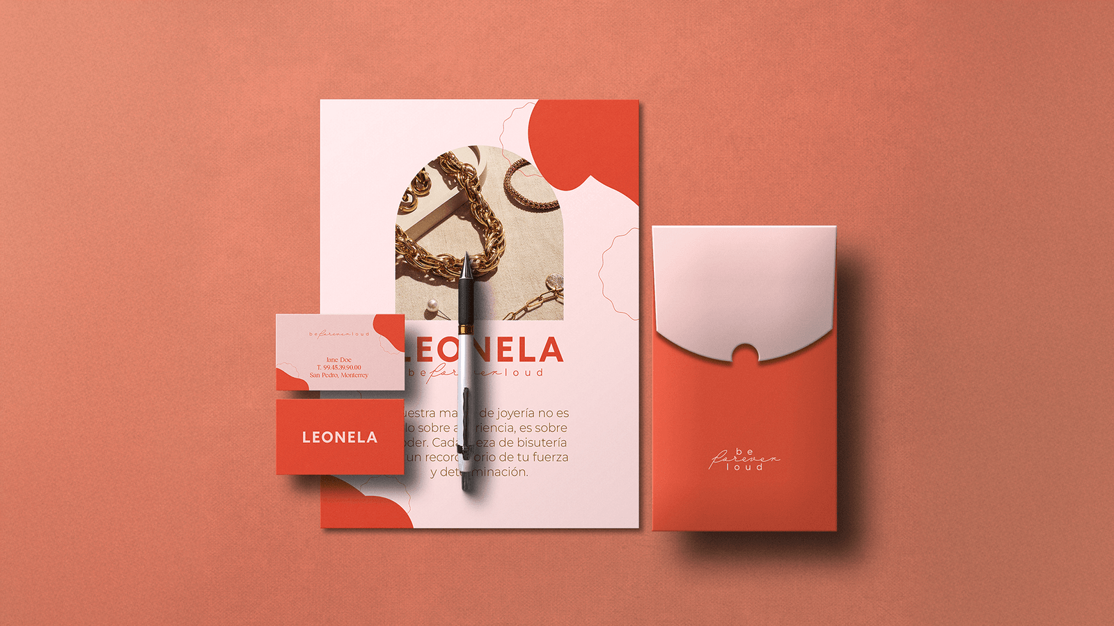
Our approach to branding was to capture the essence of Leonela and convey it authentically. We designed a visual and verbal identity that celebrates femininity in all its forms, highlighting that each woman has a unique story worth telling. Thus, Leonela’s jewelry not only adorns but also becomes a tool for personal expression and freedom.
The result is a brand that inspires confidence, emotionally connects, and empowers its audience with a clear message: being authentic is the true jewel. ✨

by freddy__gtz | Aug 9, 2024
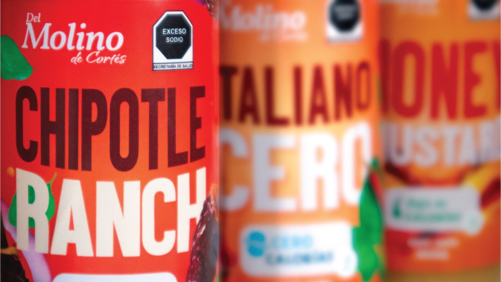
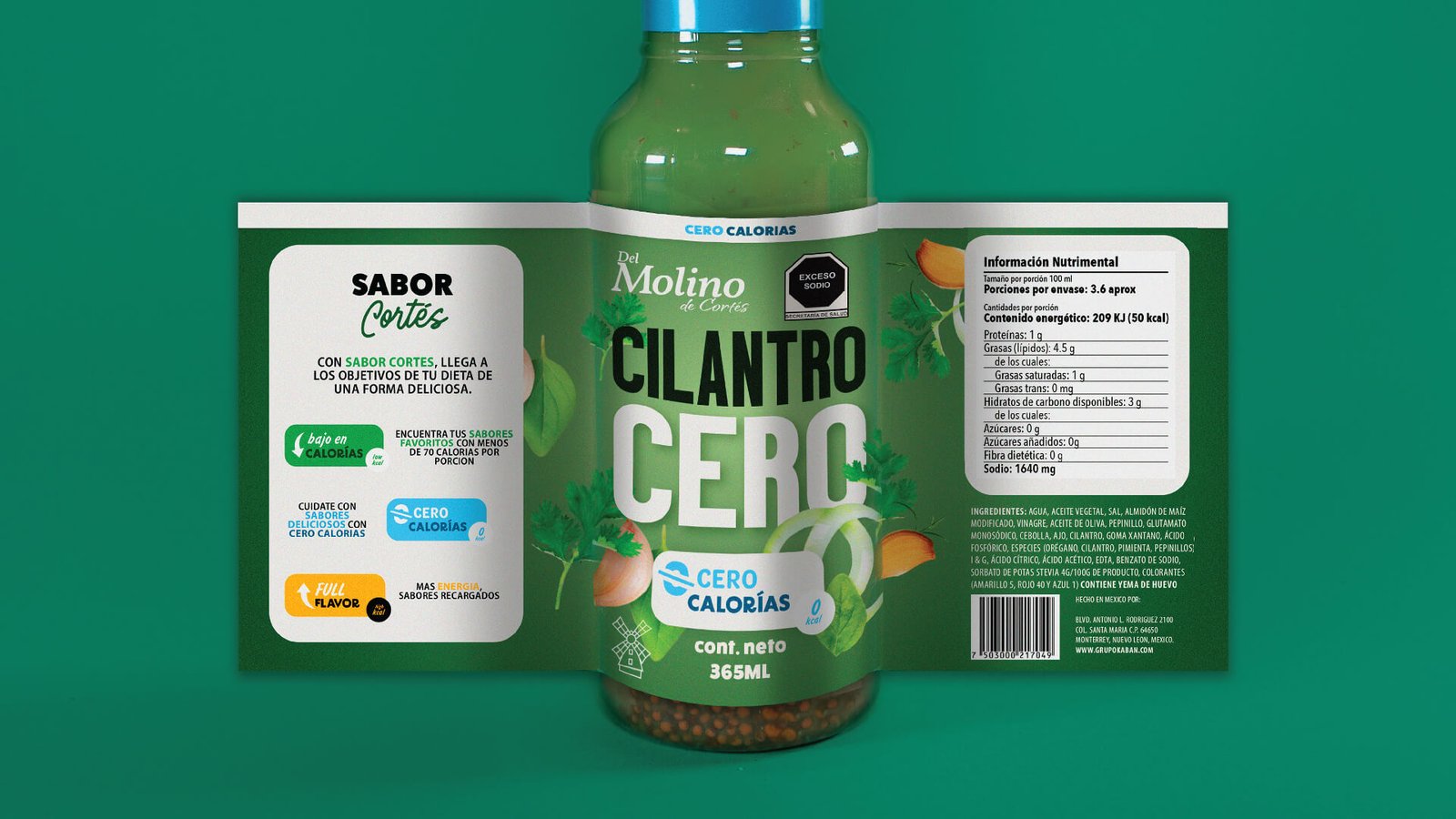
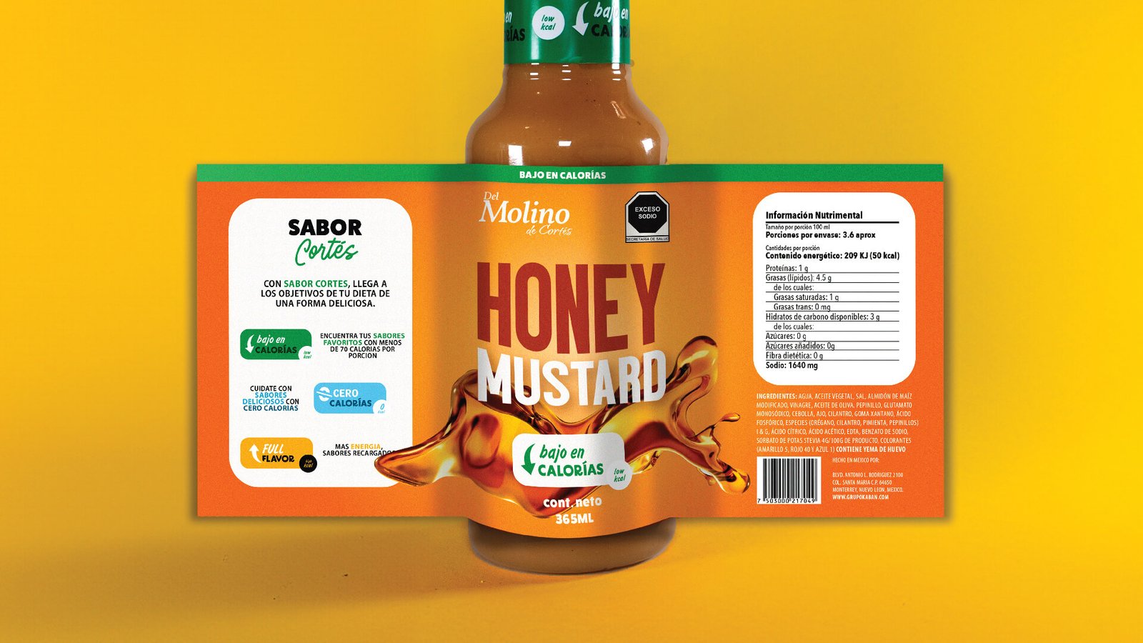
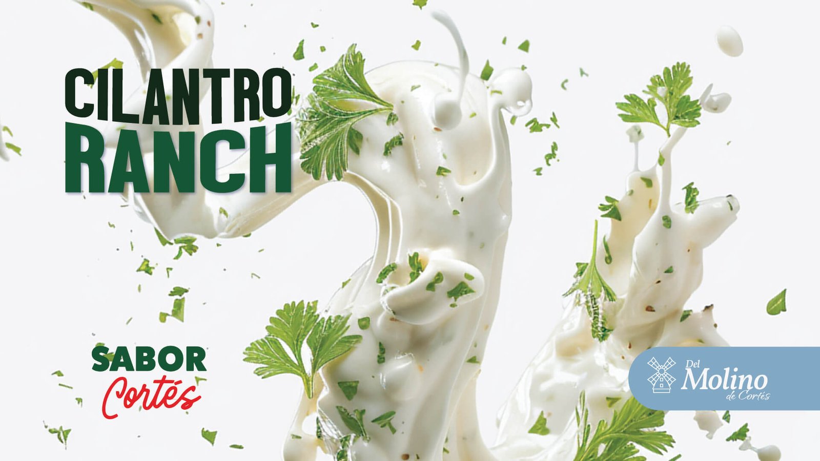
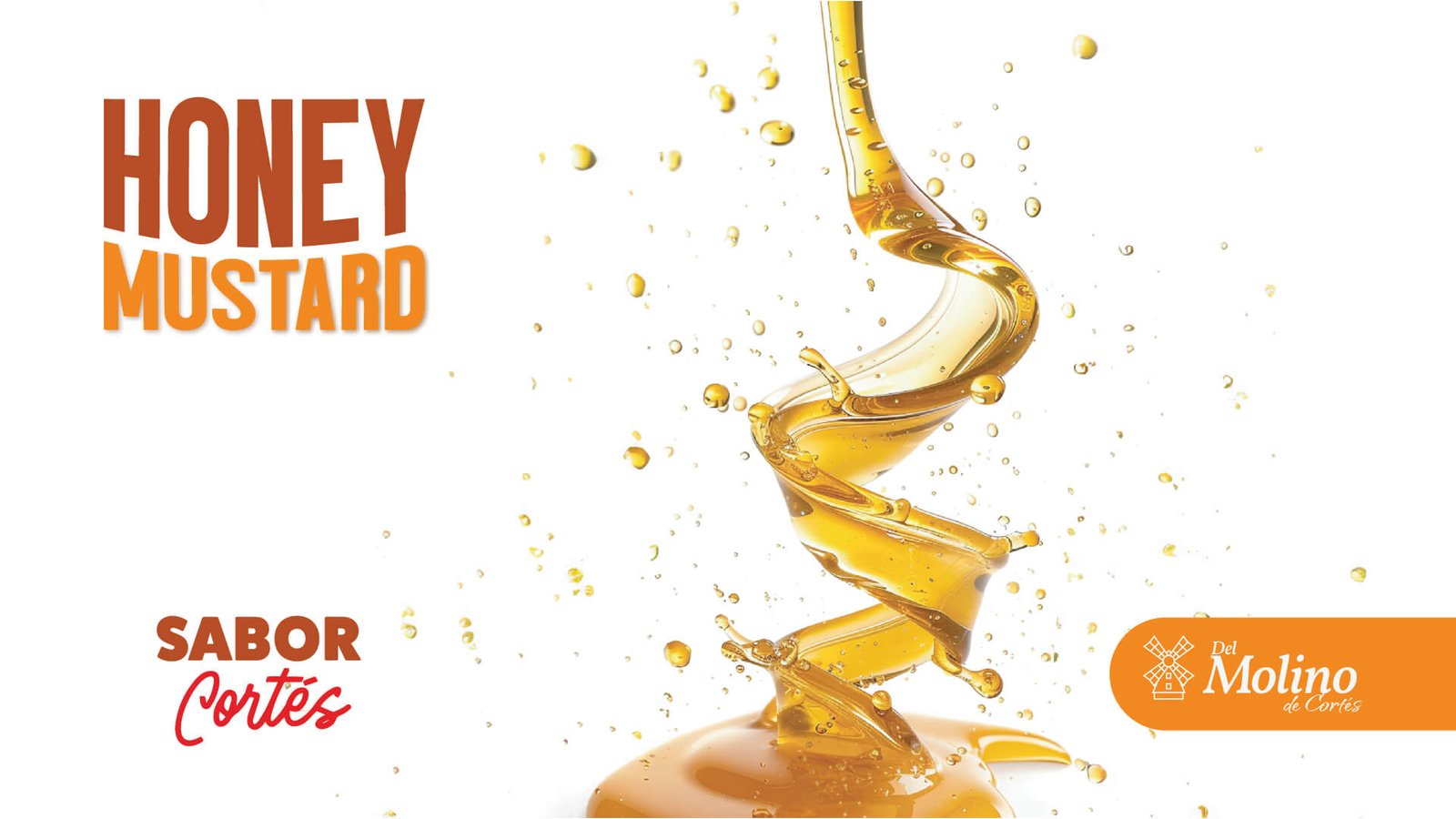
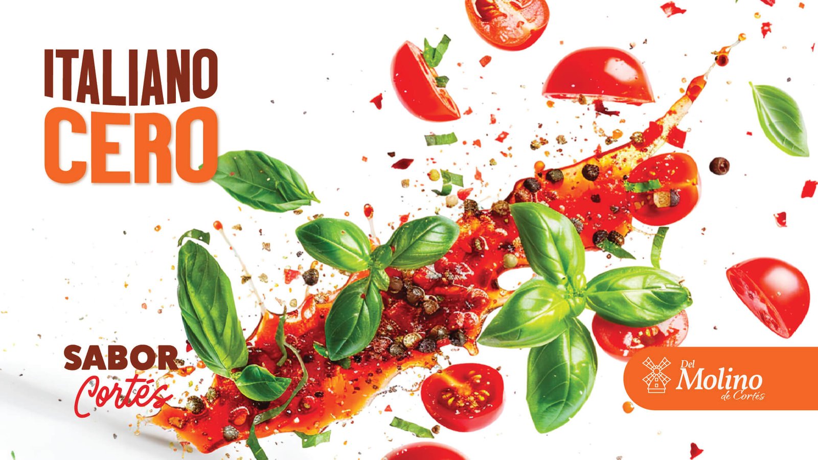
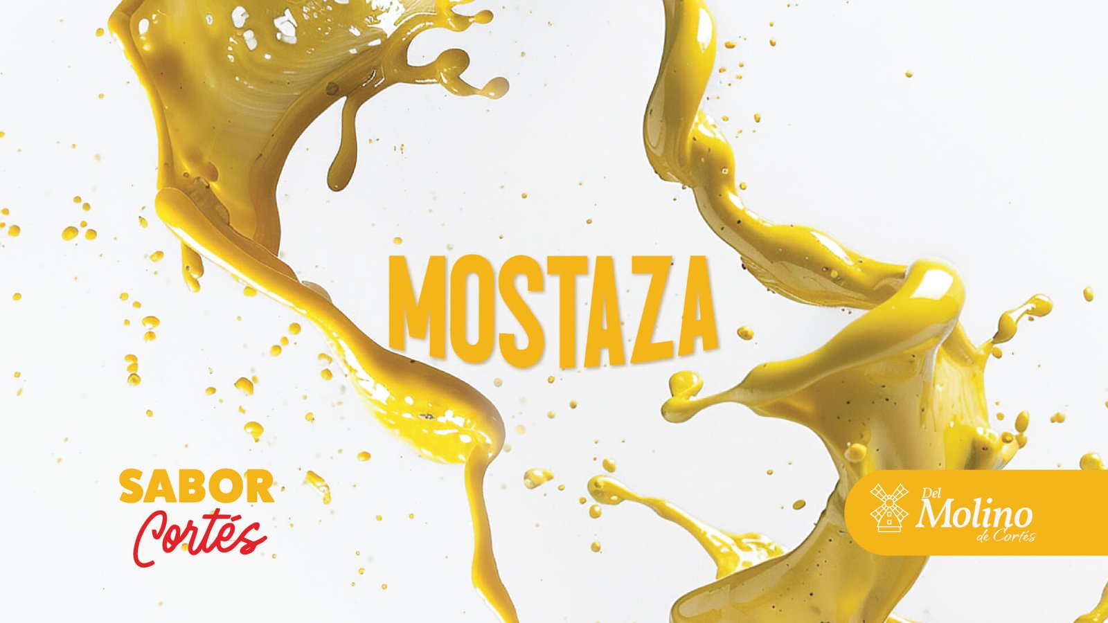
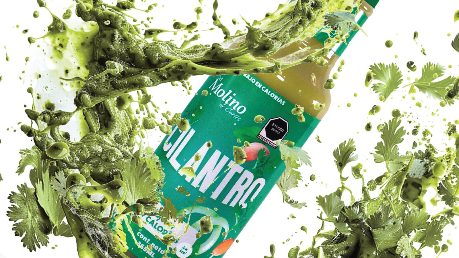
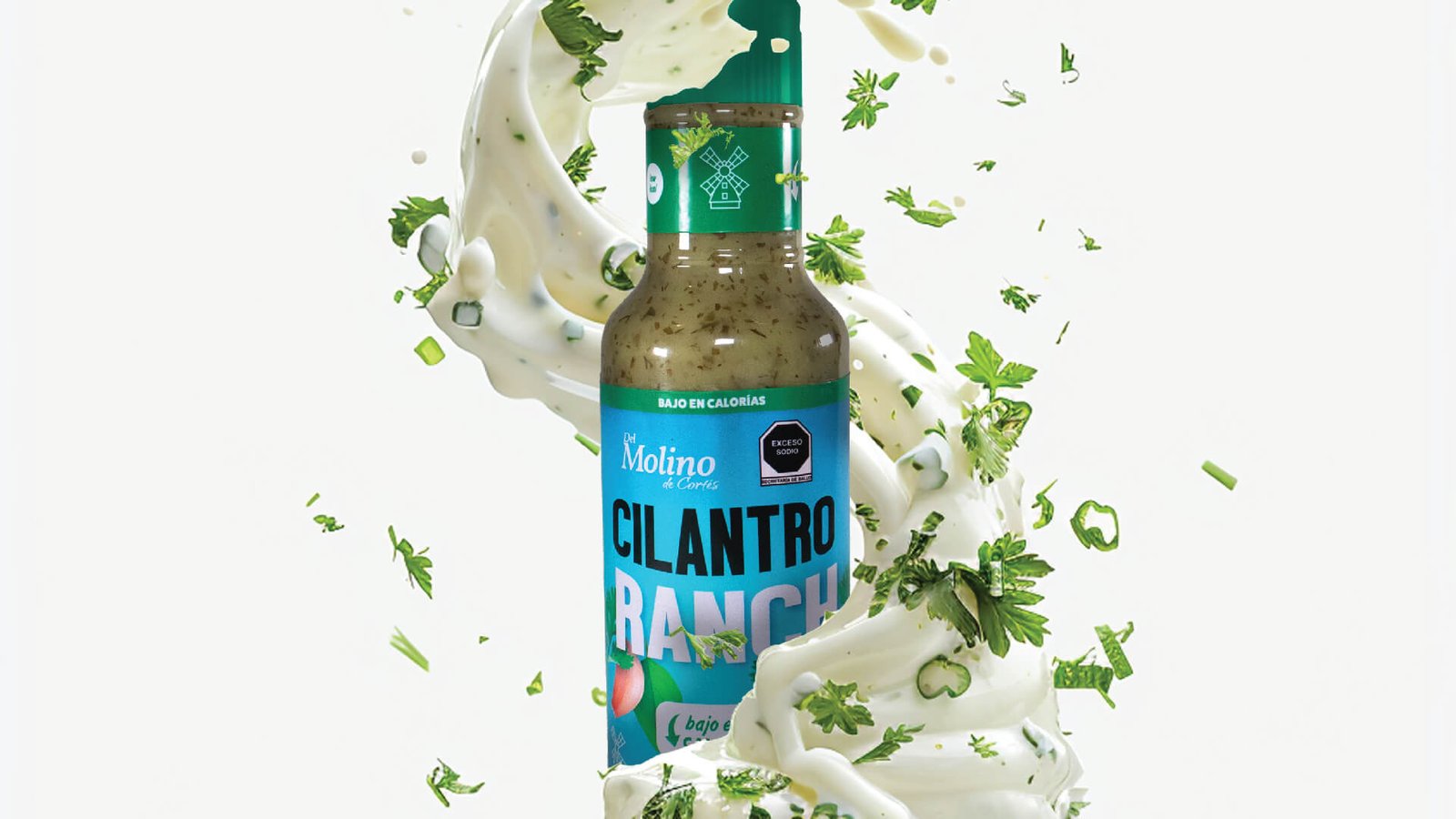
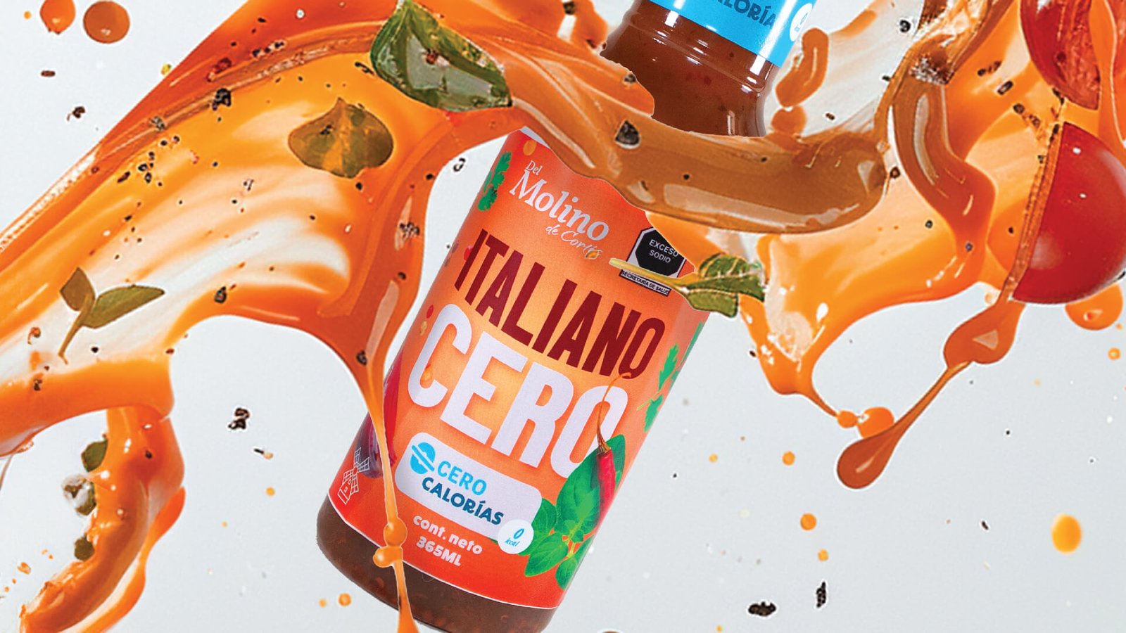
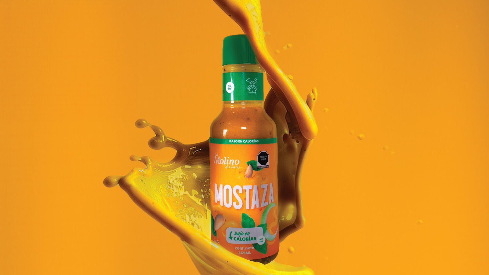
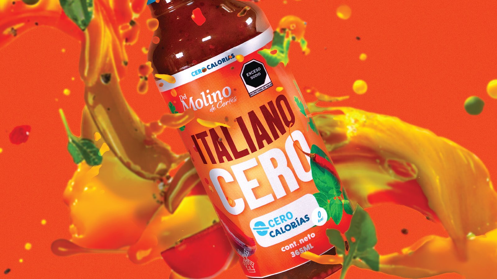
From Monterrey, the DelMolino de Cortés brand brings exquisite dressings to your table. With the Cortés family name and using the analogy “a healthy product is courteous to the body,” we created the Sabor Cortés concept to communicate that every drop of their dressings contains the love for fresh vegetables and the superior quality that only the Cortés family’s experience can offer.
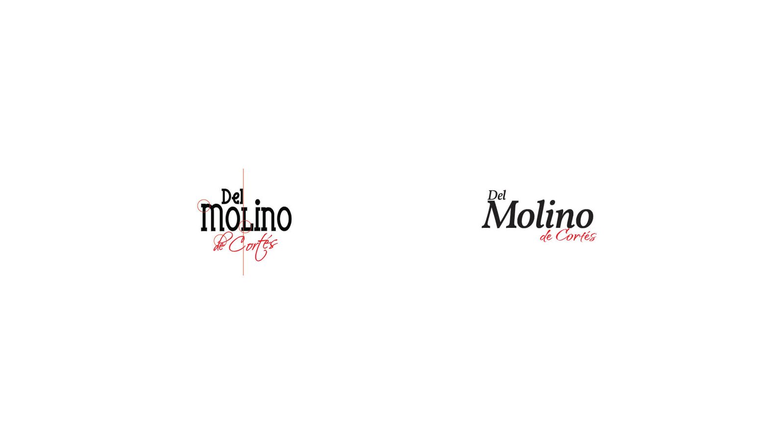
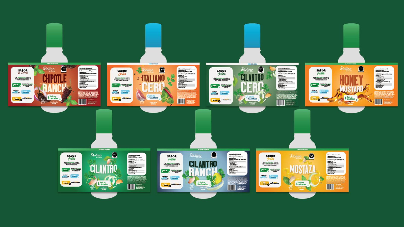
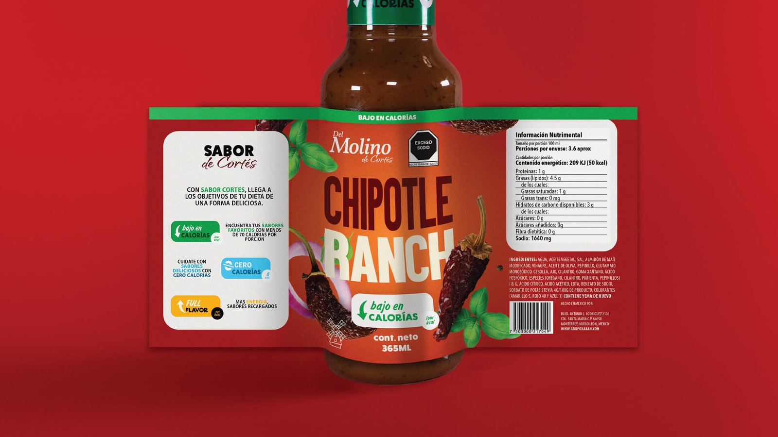
We carried out a careful redesign of the brand, preserving the base structure and aesthetic concept that defines them, but with a touch of freshness. Our focus has been on refining details, from the harmony in the use of uppercase and lowercase to the clarity of our typography, all designed to catch the eye. Additionally, we added dynamism to our packaging with vibrant ingredients and bold colors that highlight our dressings, ensuring that each product is not only a visual delight but a true protagonist on any shelf. This ensures that our visual identity is not only more pleasing to the eye but also absolutely memorable.
